In an ideal world, design principles and conventions would remain consistent across all devices and platforms. In reality, there are many differences. Just as programming languages and operating systems differ from desktop to mobile, so do design best practices.
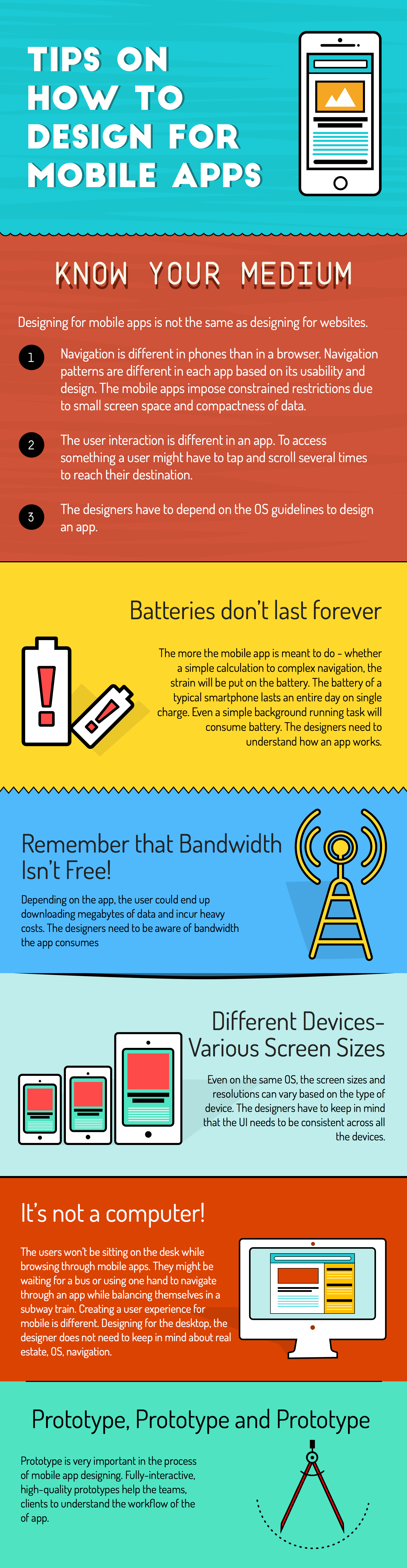
The graphic below offers tips and tricks to keep in mind when designing mobile apps to ensure that the UI/UX delights your users.
It would seem obvious that mobile apps, desktop, and mobile search are all different. But considering that 44% of Fortune 500 websites fail the mobile-friendly test, this is worth reiterating.
There are three things to remember about mobile apps as a medium when designing:
The design and functionality of the mobile app can directly affect the battery life of the device. Too many bells and whistles or features that are highly complex can drain the battery quickly. Even running background tasks can eat up a lot of battery life. Designers should understand how the app works in order to help minimize strain on the battery.
Nobody likes usage charges tacked on to their phone bill. But apps can eat up a significant amount of bandwidth, and the user could end up downloading megabytes of data – often without knowing it. Designers need to maintain a data-friendly mindset in order to provide a great user experience that doesn’t add cost when it comes time to pay the bills.
Mobile app designers face the challenges of both device fragmentation and platform fragmentation. Even on the same OS, screen sizes and resolution can vary significantly between smartphones, tablets, and increasingly, smart TVs. Designers should keep in mind that with the various device types and screen sizes, UI must remain consistent.
Mobile devices are used very differently than computers, and in-app activity reflects this. The ways people search for and interact with content is unique to desktops, and thus creating a user experience for mobile must also be different. Aspects such as real estate on the screen, navigation and menus, and OS all need to be considered if you are to provide a great user experience.
Prototyping is very important in the process of mobile app design. Fully interactive, high-quality prototypes help clients and development teams alike understand the workflow of the app and present a clearer direction to build the app how it was intended.
Ultimately, mobile app design that delights follows the principles and conventions that work best with the mobile device and best serve the mobile users. In the same way that app crashes and functional bugs push users away, poor UI/UX can impact user retention and app usage. Knowing the medium and following best practices for mobile app design will ensure that you provide an experience that keeps your users coming back.

At its core, Clearbridge’s mobile app development process is designed to take the client’s vision and make it a reality. We provide rigorous, deep-dive product definition, strategy consultation, and product roadmapping to create an actionable plan for the design, development, and delivery of the custom mobile app.


