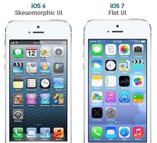
At the 2013 Worldwide Developers Conference, the new iOS 7 interface transformed from a rich 3D design to a flat 2D design which sparked a lot of conversation. Although both desat ign concepts are still used widely today, there are pros and cons for each style, depending on what your organization’s goals are. Before developing your mobile app, you need to consider which design concept aligns with your business goals and will best reflect your image.
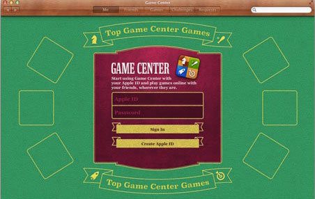
Skeuomorphism, also known as realism design, is an imitation of real objects, shadows, shapes, shades, and details from the physical world. It’s when a drawing or an illustration appears as real as a photo or a 3D image. Skeuomorphism conveys a certain theme for the app but is often perceived as too cluttered in which functionality is sometimes lost. This design concept is often associated with the outdated green background from the Game Center app which had little functionality. Skeuomorphism can be done right as it’s very intuitive however, as design is rapidly evolving, brands like Apple are deciding to adopt a more modern design approach that focuses on functionality rather than form.
Skeuomorphism (or realism design) was becoming too cluttered and outdated, especially now that the use of mobile devices are rising, apps need to be more responsive and fast-loading, putting usability first. The speed of loading times needed to be improved so that users could navigate through the app more efficiently. Functionality quickly became a goal to establish a better user experience. Flat design was then born on the other end of the design spectrum.
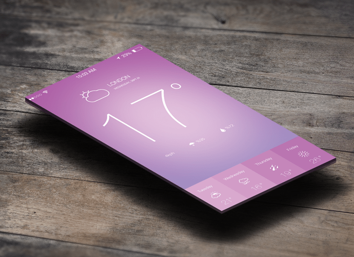
Flat design is minimalistic and stripped of all 3D elements as if the image is laying flat on a surface. It doesn’t have nearly as many stylistic choices such as 3D, textures, gradients, and many others. Instead, it offers solid colors and strokes with few or no details, and fewer shades and gradients. Flat design is a more effective design choice for app navigation and usability which makes a great option for organizations with less content.
Flat design is often misunderstood to need less attention to detail, taking less time to create. Whether the design is skeuomorphic or flat, good design inevitably takes both time and effort, just like a logo or icon design. While a logo or icon may look simple, they take a lot more time to create all the curves, angles, edges, and dimensions to depict the right image.
Our brain understands the signals coming from the eyes and translates them into shape recognition. The amount of shades, shadows, and details make the difference between a circle and a ball, or a cube and a carton box. The human brain is able to innately identify depths, levels, textures, and features. Essentially, Skeuomorphism is more intuitive from the user perspective to work with object imitations that are close to reality. After time working with skeuomorphic design, the brain becomes trained to recognize the shapes even with fewer shadows and details. Skeuomorphism at this point, becomes easier to use and is perceived to be stylish rather than childish.
Flat design focuses on raw functionality, opposing the artificial design elements to have a simple design. Many people recognize flat design through the familiarity of both the Microsoft and iOS interface. With the focus on functionality, the user experience is more practical and efficient, in which the user can focus on the purpose of the app, whether it’s retail, gaming, or any others.
It’s always difficult to put limitations on design style because it’s a form of artistic creation and a reflection of the brand. Design guidelines must be based on the goal of the project, the platform, the audience, market requirements, and the brand itself.
When choosing a design style for a mobile device, there are many considerations to keep in mind, such as designing for smaller screens by adopting a minimalistic style. If you want your app to be user-centric, functionality must be a priority. For a more flashy app with animations, skeuomorphism may be the better choice. For some, a mix of the two may be appropriate, all while keeping the app user-friendly.
It’s important to choose a design style that will best represent your organization’s goals by communicating your content in the most effective way possible. Understanding the pros and cons of each design style will help guide the design team build an app that reflects the brand’s image. Whether you choose a skeuomorphic or a flat design, the most important aspect of a mobile app is a user-centric navigation to optimize the user experience.