This updated post was originally written by UX/UI Designer Chloe Blanchard.
The most successful mobile apps have substance behind them. If a company’s mobile app attracts and engages users, they have the potential to build a lasting relationship. To turn first-time visitors into loyal long-term users, an app must have something that users value. If a company’s mobile app is not useful, helpful, or has poor usability, it will result in a negative perception of the brand as a whole. To avoid this, developers must focus the mobile app design around their target demographic and curate the experience specifically tailored to them.
Content is the most critical piece of mobile app design. With the growing trend to consume digital content on mobile devices rather than a desktop, knowing how to capture your reader’s attention on mobile is becoming increasingly important. In this context, content in mobile app development is defined as whatever you are using (language, visual aids, etc.) to engage the user.
More often than not, the existing or incoming content that development teams are given to work with is problematic. Data can be unreliable or formatted incorrectly. Character and line lengths can get out of hand quickly if they aren’t strictly managed. Copy is almost always longer than desirable and is a struggle to cut to down with multiple stakeholders involved. Designing for mobile introduces a unique set of pain points due to the small screen sizes.

Every member of the team serves as the content king during some point in the development process. Large scale projects can involve writers from different teams – from marketing to legal – and multiple incoming data channels that require technical strategies to manage.
Part of a UX Designer’s job, however, is to understand the incoming content, and to facilitate where, when, and how much content is displayed to the user.
Mobile does not have the same user experience as web content. Even seemingly short pieces of text on the web can be hard on the eyes when reading on a mobile screen. Sometimes clients try to hold on to their lengthy SEO copy, but less is more on mobile. Responsive websites need to use creative solutions so users aren’t faced with endless scrolling through blocks of copy.

You have to create an experience for the user that is tailored to the device they’re using. This includes the placing of buttons, font size, color selection, call-to-actions, and other mobile elements. You want to make it as easy as possible for the user to consume your content with as little pinching and zooming as possible, so present the information to your users in a simple and clear way.
A poorly designed app doesn’t just affect the public’s perception of that app; it reflects badly on the entire brand. Since most users nowadays are mobile, the usefulness, helpfulness, and usability of your mobile app reflects directly back onto your company. Here’s how to optimize your content for your mobile app to enhance the overall user experience:
Mobile devices have significantly smaller screens when compared to desktops, which means that one of the challenges of mobile app design is to fit a lot of information into a smaller area. In many cases, mobile apps contain content that is condensed to fit the size of the screen. Instead, you should be tailoring your content for mobile, rather than copying it verbatim from web. Including too much information in your mobile app will undoubtedly result in a poor user experience with frustrated users digging to find what they’re looking for.
Above all, content needs to be legible. A good size for mobile text font is around 11 pts so that your users will be able to read your content without straining their eyes. If your users need to zoom in to read the font, it’s likely that it’s too small. Proper line and letter spacing will allow users to consume the content from a comfortable distance, resulting in better legibility.
Comprehension is often impaired when users are consuming content from a mobile device. This is because there is less information to consume.
Contrasting colors will help users see and comprehend your content with greater ease, translating into better usability. Remember that users are often outdoors when consuming content on mobile so visibility must be a top priority.
When users are consuming content on mobile, their attention span is shorter. Because of this, you must cut out all the clutter and focus the content on what’s really important. What will help the user complete their goal? Any filler information will distract the user and inhibit them from doing what they originally intended. Cluttering the app will, therefore, result in lower conversion rates, whether that may be purchasing a product or signing up for a newsletter. Remember that every added button, icon, or image will increase the complexity of the screen. Ask your team what elements are the most important. You should adhere to one call-to-action per screen, which will result in better user comprehension.
It’s important to prioritize brevity by reducing unnecessary content that is cluttering the screen.
As mentioned earlier, user behaviors are much different on mobile. This means that you need to optimize the UX for touch. It’s important to limit the number of hand gestures and actions users must take to complete a goal or navigate through the app. Users often use one hand to navigate on mobile so ensure that you’re placing buttons with the physiological behaviors and patterns in mind. This includes placing buttons in areas of the screen where the thumb can reach.

In addition, reducing the number of screens or tabs a user has to navigate through will improve the usability. Burying your content in a complex user journey can be frustrating. Using “hamburger menus” and navigation tools can help users find what they’re looking for.
Ultimately if you want your audience to use your app, you must make it user-friendly. Making the navigation of the app as simple and natural as possible is an essential part of the design and development process.
Content can often be overlooked at the start of a project but it should be an important piece of the discovery phase. Getting to know the client’s existing content and data can inform design decisions and get the ball rolling for content management discussions. Starting your designs with realistic dummy data, rather than lorem ipsum, can open the conversation to potential oversights earlier rather than later.
The development team should work with the client to develop a content plan catered to the needs and wants of the target audience, the hierarchy of content pieces and call-to-actions. At this stage, the team can discuss possible technical solutions to handle difficult data. Error handling and messaging is important to establish early on as well.
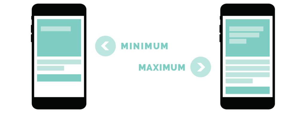
Don’t be afraid to establish boundaries. While the content is being discovered and/or created, it is important to define limitations for copy and input fields. It is important to give writers a guide for minimum and maximum character lengths. For user-created content, set as many rules as necessary and give suggestions when possible to guide the user to input good data.
Test copy lengths in your designs, especially for screens where copy is expected to fluctuate. You can’t design one screen for the ideal length of content. Screens should not look empty with the minimum copy just as much as they shouldn’t be overflowing with the maximum. At times, alternative design solutions will need to be programmatically enforced to handle longer or shorter copy than desirable. Keep your designs flexible, plan for iteration, and focus on a healthy balance of important content.
Content guides can communicate the decided upon limitations so they can be implemented in the CMS and the app. Test your content in the app thoroughly on multiple devices, screen sizes, and rotations to ensure it is displaying as desired. Make sure any default, offline or empty-state copy is relevant. Seek out edge cases of oddly formatted content, especially where users are inputting data.
This is a scenario that you have little control over. You can hope for the best but expect the worst any time a user can input content that will be displayed in your product. Users will take advantage of any freedom you give them and can push the product to unexpected lows, so make sure to provide a pleasant and enjoyable experience.
If your customer database is stored in an outdated system or full of ugly data, utilizing it for a sleek new digital platform can be challenging. There are often technical solutions to smooth out the kinks but sometimes the data system requires more of an overhaul than expected.
When you develop an app, it’s not just about the short-term conversions but providing value to boost customer engagement and satisfaction. This will translate into long-term, loyal users.
To remain relevant in the app market, your content must be targeted and relevant. Who are your users, and what do they need? You need to make it very easy for them to meet their particular needs as quickly as possible. Identify the core needs of your users, and develop an app that directly and thoroughly meets that need.
Content has to remain relevant over time. Don’t develop an app just to meet users’ one-time needs. Instead, design an app that delivers continuous value.
Some apps serve a short-term purpose but fail to meet users needs and engage them long-term. If a user decides to download your app, you need to make sure they’ll keep it installed on their device.
There are several ways to do this, and many app developers use two or more of these methods to stay relevant including the use of push notifications, geofencing, and delivering content that is user-specific.
With a strategic content plan, your app can remain relevant in the competitive app market. Over time, you’ll need to find new ways to keep your mobile users engaged with your app, and more significantly, with your brand. Your mobile app is an extension of your brand, one your users can and will take everywhere — as long as you offer them value.
While many companies over the last several years have invested in mobile experiences for their users, they haven’t successfully implemented a content management strategy that will give them the competitive edge they need. The companies that develop apps but ignore their content strategy and maintenance often struggle to retain their users and find very limited success.
Good content is a crucial aspect of a good user experience, so it’s important to keep it a priority throughout the project, not just at the point of populating it into the app. Allow the content to inform and inspire your designs, but don’t settle for bad content. Copy can be improved, and ugly data should not limit the potential of a product. Work together with your team to optimize your app’s content, even if it requires a creating a roadmap and stages of improvements.