“Good design, when it’s done well, becomes invisible. It’s only when it’s done poorly that we notice it.”
With today’s exceedingly competitive mobile app market, it’s more important than ever to stand out and develop a unique brand identity through user experience (UX) design. While most companies recognize the value of mobile app design as a central driver for long-term success, they often don’t understand how to use UX design to open new lines of business through mobile and create a competitive advantage.
Many people confuse UX with user interface (UI) design, however, there’s much more to UX than visuals. UX Designers consider the who, what, why, and how of mobile product use. In mobile app development, it is critically important to ensure the product’s character and content matter translates through technology to offer a seamless, fluid, and meaningful experience. Otherwise, the product will fail to meet the objectives in all areas of a mobile business structure.
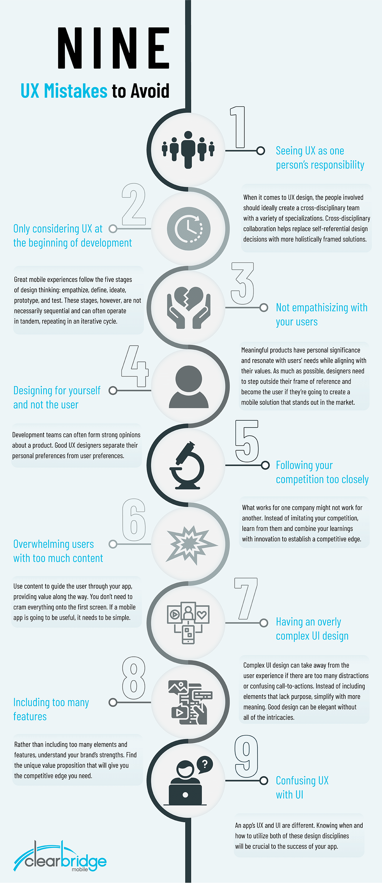
The misunderstanding surrounding UX stems from the overlap of skill-sets and tools involved in both UX and UI design, as well as several common misconceptions about what UX is and how it fits into the mobile app development process. This article will list nine common UX mistakes to avoid in mobile app development and how to use the principles of design thinking to keep UX considerations at the forefront of the entire product lifecycle.
UX isn’t just the responsibility of one department or an individual designer. The whole product team should be involved in the mobile app design process. Specifically, everyone involved in the project should understand the common goal and product vision, which they deliver collectively.
It’s important to ideate with every stakeholder during product definition. Making design decisions collectively helps ensure the final product closely resembles the company’s ideas and concepts, while simultaneously meeting specific project goals. Collectively owning a product’s UX design is important for several key reasons:
When it comes to UX design, the people involved should ideally create a cross-disciplinary team with a variety of specializations. With that said, it’s important for each team member to think outside of their discipline to create meaningful collaborations. Often, individuals with specific knowledge about particular business functions will solve problems on their own level of experience. It’s very easy for IT, engineering, product management, marketing, and sales departments to make decisions and view challenges through a departmental lens. Involving everyone – upper management, product managers, marketing, developers, designers, and clients – will help examine problems in greater detail from several perspectives and backgrounds. More importantly, cross-disciplinary collaboration helps replace self-referential design decisions with more holistically framed solutions.
UX design is an ongoing effort. Great mobile experiences follow the five stages of design thinking: empathize, define, ideate, prototype, and test. These stages, however, are not necessarily sequential and can often operate in tandem, repeating in an iterative cycle. The stages of the design thinking process should be considered as separate roles that advance the design’s entirety. The end goal is to arrive at a cohesive understanding of the product’s purpose and audience.
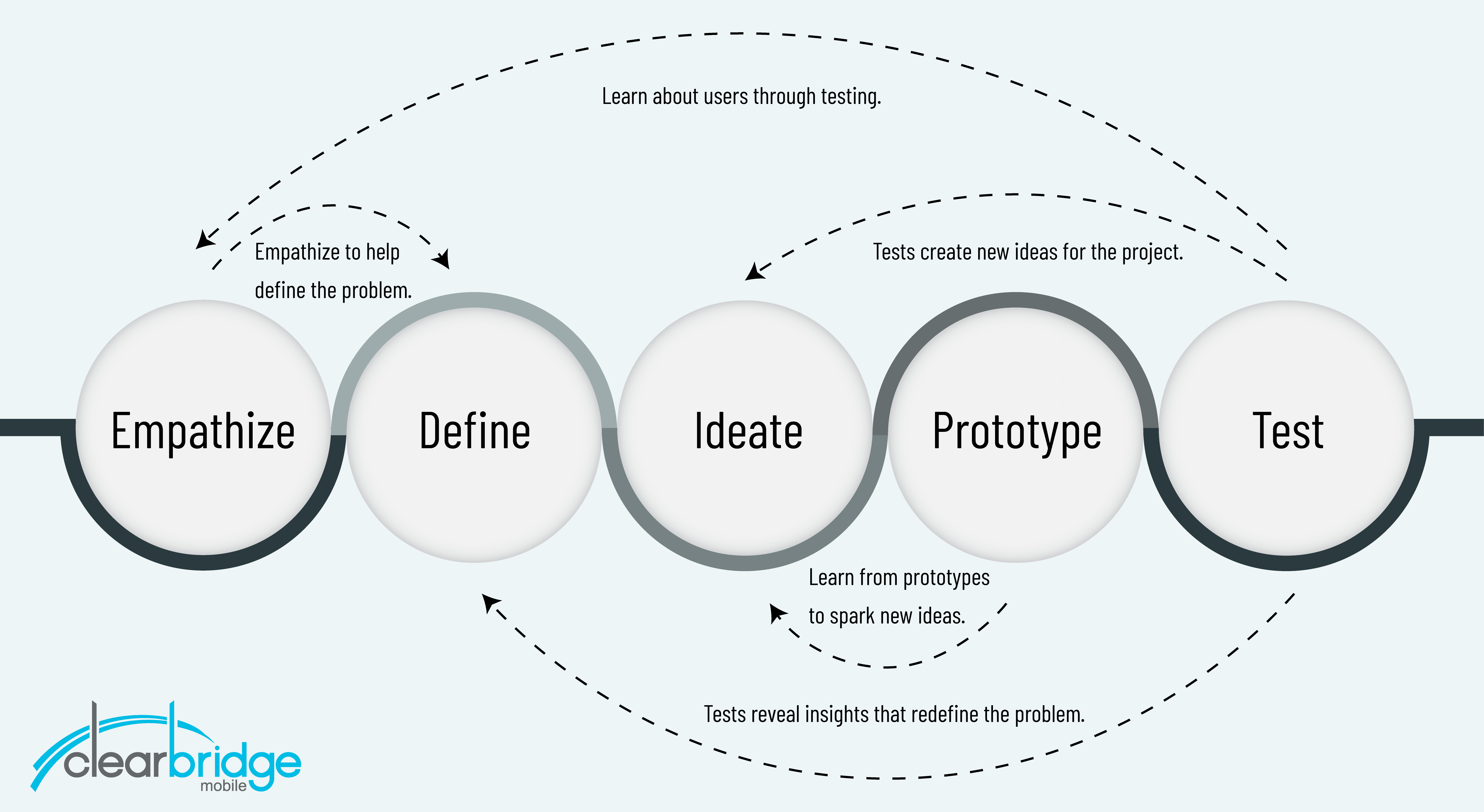
Essentially, the entire process establishes expectations for the mobile product. Designing a great mobile experience starts with empathy which reveals solutions to user pain points that may not be immediately apparent. The process further defines the product by framing and reframing the perceived problem to gain perspective and explore as many potential solutions as possible through rapid prototyping. Developing a prototype is a cyclical activity where product teams continually review and refine the product concept, returning to the beginning of the process several times until a desirable, feasible and viable concept exists.
Good UX leaves a lasting impression. Many companies struggle when it comes to providing meaning and forming a connection with users. Meaningful products have personal significance and resonate with users’ needs while aligning with their values. Many products in the market are aesthetically pleasing and are usable but still lack meaning. How are you connecting with your user? Ask yourself what impression you’re leaving with your users. This will be the difference between an app your users return to and one they uninstall. Empathizing with users is an essential component of UX design. As much as possible, designers need to step outside their frame of reference and become the user if they’re going to create a mobile solution that stands out in the market.
Development teams can often form strong opinions about a product. Good UX designers separate their personal preferences from user preferences. It’s important to understand that you are designing for a core set of users with specific needs and wants. This user-centric design approach should be practiced throughout the entire development process so that the app doesn’t evolve to fit the needs of the people creating it.

What works for one company might not work for another. Instead of imitating your competition, learn from them and combine your learnings with innovation to establish a competitive edge. When you follow suit to your competition, you aren’t providing anything new for your users.
There is no mobile app cheat sheet, (but there is this checklist). Certainly, there are sources of inspiration to draw from, but trends that work for other companies may end up outdating your app down the road. Instead, analyze what trends are working, then apply this insight to suit your business and user’s needs; you can improve, customize, and build from this foundation. As with all products, research will make for a stronger experience overall.
Information overload is notorious for ruining a design, but following by the principles of design thinking you can dramatically reduce confusion. Parking signs, for example, are a prime example of information overload. Most of the time, parking signs need to display a lot of complex information in a small space which makes them very hard to process at a glance.
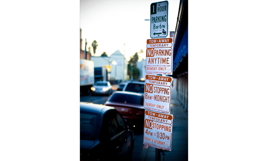
Imagine you’re looking for a place to park on this road on a Friday afternoon around 4 p.m. Can you park here? What you think would be a simple question actually requires a lot of mental processing. Designing a mobile UX deals with a lot of the same problems from this parking sign example; often, mobile apps need to communicate a lot of information within a small amount of space.
This particular parking scenario can be fixed by adopting a user-centric approach to design. Drivers simply want a yes or no answer to their problem – can I park here?
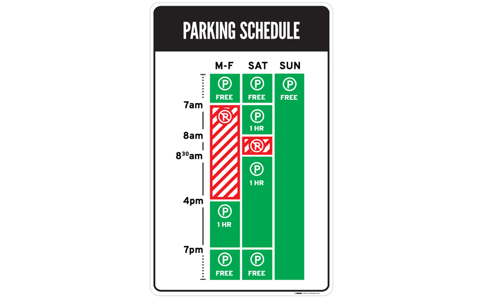
Source: Nikki Sylianteng
By using visuals instead of text, and making use of conventional understanding (green for yes and red for no), people can instantly process the information from the parking sign. On a Friday afternoon at 4 p.m., parking is allowed.
Use content to guide the user through your app, providing value along the way. You don’t need to cram everything onto the first screen. It overloads users with information, in turn, frustrating them. Users like the interactivity of mobile app design because they enjoy the satisfaction of self-initiated discovery. If a mobile app is going to be useful, it needs to be simple.
On the other hand, don’t omit important information. Be concise and intuitive but not sparse. Draw users in with a question, bold statement, interactive element, or anything that invites the user to participate and engage. Good content is a crucial aspect of a good UX, so it’s important to develop an effective content strategy.
Good UX doesn’t always have a fancy, intricate design. Complex UI design can take away from the user experience if there are too many distractions or confusing call-to-actions. Instead of including elements that lack purpose, simplify with more meaning. Good design can be elegant without all of the intricacies.
That doesn’t mean that large-scale animation doesn’t have a place. While in a game they are expected, in an everyday app, they should be used sparingly and to celebrate a special event or a time-consuming process. Some examples of when to use animations are for loading indicators or pull to refresh.
Rather than including too many elements and features, understand your brand’s strengths. When you visit a restaurant with a menu that has every type of cuisine, it can overwhelm you. While it may seem beneficial to cater to everyone’s needs, it’s disjointed and puts into question the restaurant’s ability to truly specialize in what they’re good at.
This is just as relevant to brand identity. If your app includes everything for all types of demographics, you won’t please anyone. Instead of establishing loyal users, you’ll end up frustrating them. Not only is this bad for user retention but the perception of your brand as well. Find the unique value proposition that will give you the competitive edge you need.
The UX & UI are different. Mobile app design concepts are continually evolving. As the nature of the work changes with technology so does the way people describe it.
It’s nearly impossible to extricate the UI from the UX and vice versa. You can’t work on one design concept without considering the other. UX design is so subtle and natural that it seems obvious and effortless for the user. The amount of analysis involved is invisible to the end-user. It is the foundation or the structure of the app. UI design, on the other hand, consists of compelling and aesthetically pleasing interfaces with which the user interacts with. It is the exterior. Knowing when and how to utilize both of these design disciplines will be crucial to the success of your app.
These 9 mistakes can derail projects from maximizing their impact on business outcomes. Further, understanding how to overcome common UX mistakes will encourage flexibility and breakthrough perceived limitations. When you eliminate the barriers, these common UX mistakes impose, the result is a better end product that delights your users.
Design thinking is an iterative process that supports UX innovation. The process aims to interpret users, validate product assumptions, reposition pain points and create solutions to prototype and test. Design thinking is particularly beneficial for solving poorly defined problems by observing and considering multiple perspectives or solutions. The core principle of design thinking asserts that a user-centric approach to experience design encourages innovation, which leads to market differentiation and competitive advantage.
The design thinking framework is cyclical, flexible and involves the collaboration between product teams and users to create mobile products inspired by how real users think and feel. By practicing design thinking, product development teams can identify the core purpose of a mobile app, its business objectives, user pain points, and more importantly, the most human-centric approach to resolving user challenges.
In recent years, it has become more consequential for businesses to refine the skills necessary to identify and act on rapid market changes and preferential behavior of customers. The world of business in more interconnected and complex than ever before. Design thinking offers a formalized framework to maneuver through changing conditions with a human-centric perspective, and ultimately discover new ways to meet user demand.
Design thinking has become somewhat of a buzzword in recent years, but its popularity can be attributed to the prosperity of many high-profile, global enterprises – disruptors like Google, Apple, Spotify, Airbnb, and Uber, for example, have all leveraged the process to prominent effect. When used properly, businesses can follow suit and tap into an entirely innovative way of thinking to generate authentic connections with customers through problem-solving.